Shopify · Research · · Erick Nolasco
A free scan found 3 accessibility problems on this Shopify store. There were 12.
I wanted a Shopify store I could test from top to bottom without poking at someone else’s business, so I built one. Linen & Oak is a made-up clothing brand. It runs Horizon, Shopify’s current free theme, with twelve products and three apps a lot of small shops install early on: Judge.me for reviews, Shopify Inbox for chat, and Shopify Forms for a newsletter popup. I left the image alt text blank, because most stores do.
Then I audited it the same way I’d audit a client’s store.
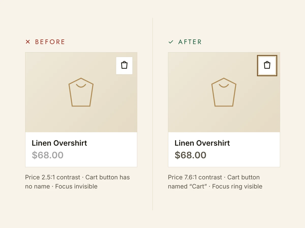
What the scanner saw
I started with axe, the engine behind most free accessibility checkers. Across the home, collection and product pages it flagged three real problems, plus one warning that turned out to be a false alarm. If that were all you looked at, you’d probably call the store in decent shape.
What testing by hand found
Then I put the mouse away. I tabbed through every page with the keyboard, read through the code, and later went through the product page with VoiceOver. That turned up nine more problems, for twelve in total. A few of them:
A button you can’t see, but can land on. Horizon has a sticky “Add to cart” bar that slides in as you scroll. When it’s hidden it’s only see-through, so pressing Tab still lands on it. A keyboard user ends up on an invisible button near the top of the page, with no idea where they are.
No focus ring on “Write a review.” Judge.me removes the outline browsers draw around a focused button, so you can’t tell when you’re on it. The chat button from Shopify Inbox has the same problem. It’s also the second thing you reach when you press Tab, before the logo and the menu, even though it sits in the bottom corner of the screen.
Every photo read as the product name. With no alt text, the theme falls back to the product title, so a screen reader hears “Tie-Waist Midi Dress” for each photo and nothing about color or fit. Shopify’s AI did offer a description: “a minimalist flat illustration of a sleeveless dress or apron-like garment in muted olive green.” That’s a fair description of the drawing. It doesn’t help someone deciding whether to buy the dress.
A skipped heading level. The homepage went from the store name straight to a third-level heading. People who move around a page by its headings skipped right past the main message.
Five of the twelve problems came from the theme, five from the apps, and two from content and settings.
What I fixed
I made every change on a copy of the theme, so the live store stayed as the “before.”
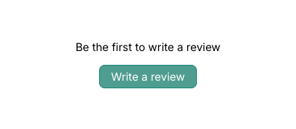
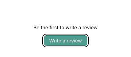
- I hid the sticky bar from the keyboard and screen readers until it actually appears.
- I added a clear focus ring to Judge.me’s buttons.
- I wrote real descriptions for all twelve product photos, like “Olive linen midi dress with thin straps and a tie waist, shown from the front.”
- I changed “Zoom media 1” to “Zoom image 1 of 1: Tie-Waist Midi Dress,” and made the cart button say how many items are in it.
- I fixed the heading order without changing how the page looks.
That took about two and a half hours.
The other six problems live in code a store owner can’t edit: the chat button, parts of the popup, and two pieces of Horizon itself. I wrote those up with steps to reproduce them and sent them to Shopify support.
Checking the work
I re-ran the scanner and tabbed through the same pages again. Then I went through the product page with VoiceOver: the headings, the size picker, adding to cart, the cart count, the photo description and the review form. Everything I fixed held up.
What I took from it
Free scanners are a good place to start, but they can’t press Tab, and they can’t tell you whether an image description is any use. On this store they caught a quarter of the real problems.
The apps were the other surprise. Each one adds its own code to your store, and you can’t always change it yourself. When I audit a store, I test the apps too, fix what can be fixed from the theme, and send the rest to whoever makes the app.
Linen & Oak is a demo store I built for testing. It isn’t a real business, and no customer or client data was involved.
Want to know where your store stands?
I offer a free 5-point accessibility summary: the most important issues on your site, in plain language, with no obligation.
Get a free 5-point summary